Graphic Design 102: Colour Theory
Colour theory is a fundamental aspect of graphic design and visual communication. It refers to the study of colour relationships and how they impact the viewer. Understanding colour theory is essential for designers as it helps them choose colours that complement each other, convey moods and emotions, and help attract attention to certain elements.
Colour theory plays a crucial role in graphic design and visual communication. Understanding colour relationships and harmonies allows designers to create designs that are visually appealing, effectively communicate a message, and attract the viewer's attention. By mastering the concepts of colour theory, designers can take their designs to the next level and make a lasting impact.
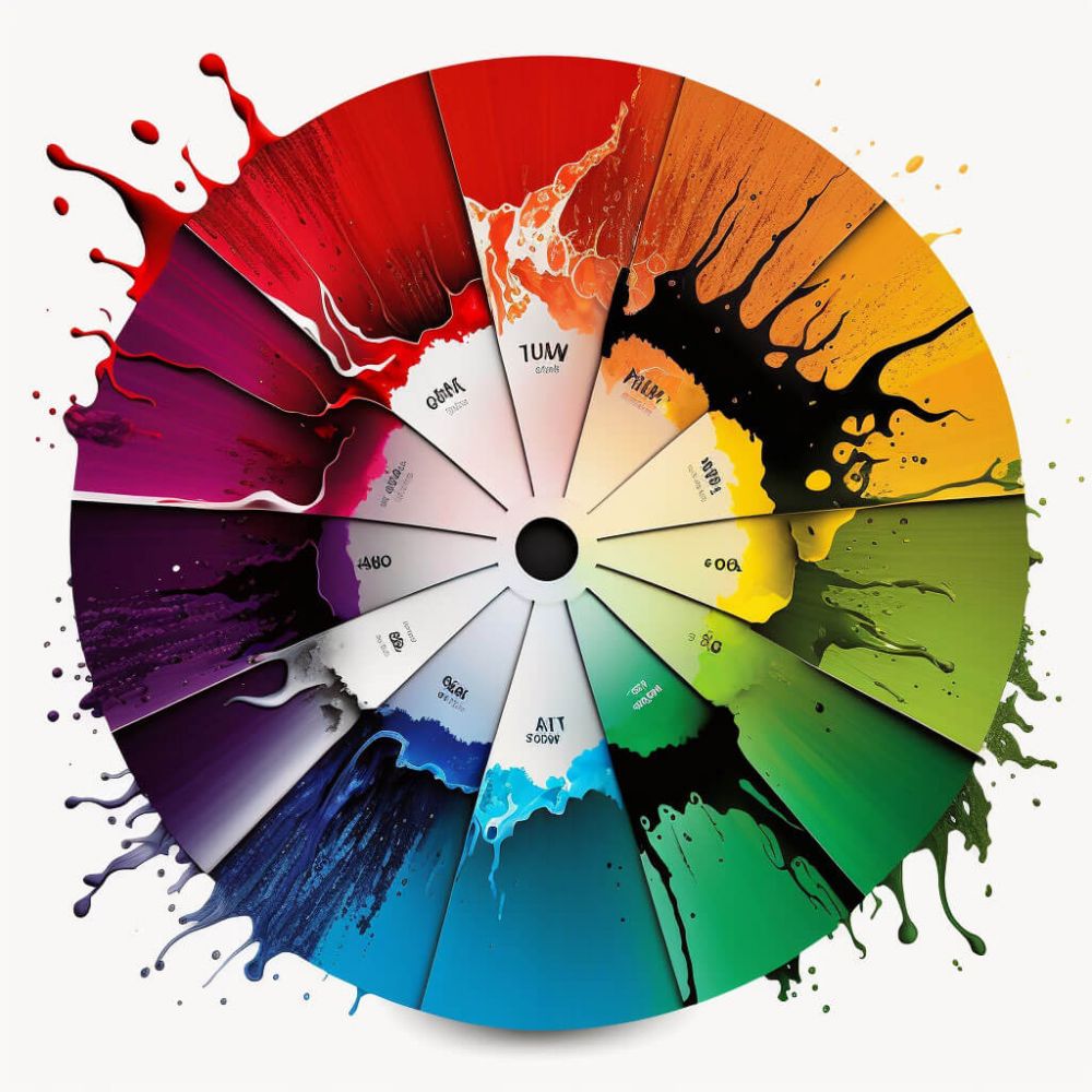
One of the most important concepts in colour theory is the colour wheel. The colour wheel is a visual representation of the relationship between colours. It shows how colours are related to each other based on their hue, saturation, and brightness. The colour wheel consists of primary, secondary, and tertiary colours. Primary colours (red, yellow, and blue) cannot be created by mixing other colours and are the building blocks of all other colours. Secondary colours (green, orange, and purple) are created by mixing two primary colours. Tertiary colours are created by mixing a primary colour with a secondary colour.
Another important concept in colour theory is colour harmonies. Colour harmonies refer to the use of colours that look good together. There are several colour harmonies that are widely used in design, including complementary, split complementary, triadic, tetradic, and monochromatic.
Complementary colour harmonies use colours that are opposite each other on the colour wheel. For example, blue and orange are complementary colours. When used together, they create a strong visual contrast and can help attract attention to certain elements.
Split complementary colour harmonies use a base colour and the two colours adjacent to its complement. For example, for orange, blue-violet and blue-green are split complementary colours.
Triadic colour harmonies use three colours that are evenly spaced around the colour wheel. For example, orange, purple, and green are triadic colours. This harmony creates a sense of balance and stability.
Tetradic colour harmonies use four colours that form two complementary pairs. For example, red, yellow, blue, and green are tetradic colours. This harmony creates a sense of depth and complexity.
Monochromatic colour harmonies use variations of a single colour. For example, a design could use different shades and tints of orange. This harmony creates a sense of happiness and is uplifting.